Welcome to the vibrant universe of design, where colours are not just a visual delight, but a language spoken in various codes.
From the precision of Pantone to the print-oriented nuances of CMYK, the luminous RGB for screens, and the hexadecimal codes that govern digital vibrancy; each colour type is a unique cipher, a specialised language that designers employ to bring their creative visions to life.
Get ready to delve into the colourful spectrum that fuels the creativity behind every pixel, print, and palette.
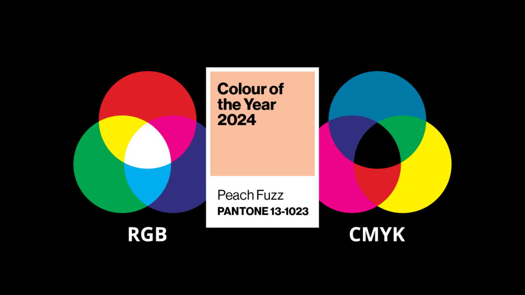
What is a Pantone colour?
Pantone colours are a universal colour system (think of the multihued wall of paint swatches at the hardware store) which should theoretically provide seamless colour reproduction in printing. You may also hear this type of colour referred to as PMS – Pantone® Matching System.
What is a CMYK colour?
Printing commonly uses layers of Cyan, Magenta, Yellow and Black inks to build colours in the printing process. CMYK refers to the breakdown or ‘mix’ of Cyan, Magenta, Yellow and Black required to reproduce a colour. CMYK colour is also commonly called the four-colour process.
What are RGB and HEX (digital) colours?
RGB colour mixes together Red, Green and Blue to create a colour. Another way of representing a RGB colour is through hexadecimal colour or HEX colour. HEX colours are expressed as a six-digit combination of numbers and letters and are interchangeable with RGB colours. Designers and developers commonly use HEX colours as they provide a compact and easy-to-read way of specifying colours in digital design.
Choosing colours for design (a little history)
Once upon a time, not so very long ago (about 15 years), it was very expensive to print in four colours (CMYK), so brands relied on one colour or two colour printing. In order to print this way, Pantone swatch colours were used. Pantone swatch colours provided a universal system to enable accurate colour reproduction.
When choosing brand colours, it was very important to have an attractive Pantone colour which converted as seamlessly as possible to CMYK.
Digital colours were still important but were last in the line-up when choosing colours for a brand.
In my opinion, the order of importance was: 1. Pantone, 2. CMYK and then 3. Digital.
Fast forward to today
In today’s world, many brands have a much stronger digital presence and it’s safe to say their digital collateral outweighs any printed materials (possibly with the exception of retail packaging for large consumer brands).
As a result, we’ve seen the importance of choosing colours for branding flipped on its head.
I now believe the importance of choosing colour for many brands is: 1. Digital, 2. CMYK and then 3. Pantone.
Colour accessibility in branding
Colour accessibility means colour combinations with enough contrast, so the content is clearly distinguishable from the surrounding page or background.
Today, where digital reigns supreme, accessibility has become a fundamental requirement for branding.
Making a design accessible automatically makes it available to more people. Not only is it especially important for users who are low vision or for users who are colourblind. Good colour contrast means all users can see your content no matter the device they’re using or the lighting of their surroundings.
Legibility has always been a key component for effective design but when we look specifically at colour and accessibility/legibility there might be some surprises, as the graphic below outlines.
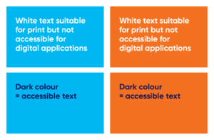
For modern branding we strongly advise that you consider accessibility and colour in your brand strategy and have a clear guide on hand for what is accessible and what is not (particularly with text).
We created the below accessibility guide for one of Zadro’s client’s brand style guide, looking specifically at text legibility with the client’s brand colours.
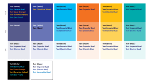
Having a quick reference guide on hand (that you follow), such as the above, ensures that your digital assets are being well-received by the largest audience possible.
If in doubt, use a contrast checker. A freely available tool that we use all the time at Zadro is Colour Contrast Checker.
The Adobe/Pantone breakup
Back to Pantone colours. In late 2022, colour chaos ensued in the graphic design industry when Pantone started phasing out its integration with Adobe Software (the dominant software used for design, development, and branding). No longer were designers able to select the majority of Pantone colour sets.
In late 2022, limited Pantone sets were still available; by the end of 2023, ALL the Pantone sets were removed and were no longer available in Adobe products without a subscription to Pantone Plus.
The added expense for business in paying for Pantone Plus, combined with the dominance of digital (Pantone colours falling to rank three in importance) and the rise of alternate design tools such as Canva (which don’t have a system for adding Pantone colours to Brand Kits) has had many people asking Zadro…
Are Pantone colours still needed?
In short, yes. They are still relevant for your brand; however, we don’t believe they are as important as they used to be.
Why? We believe the most relevant use for Pantone colours in today’s world is merchandise or promotional products – pens, umbrellas, hats, clothing, etc. Producers of merchandise will usually ask for your brand Pantone colour(s) so they can colour-match as closely as possible – they may not use the actual Pantone colour but the Pantone guide provides a universal reference point for calibration.
While most brands in today’s world are accustomed to slight variations between printed and digital colours, a brand colour is critical to your brand identity, and Pantone still provides one of the best universal systems for ensuring a colour match between print, digital and single colour (Pantone Swatch) printing.
We have a very handy one-pager that demystifies design lingo. Keep it within reach so that next time someone mentions different colour types or file formats, you know exactly what they’re talking about. Available here.